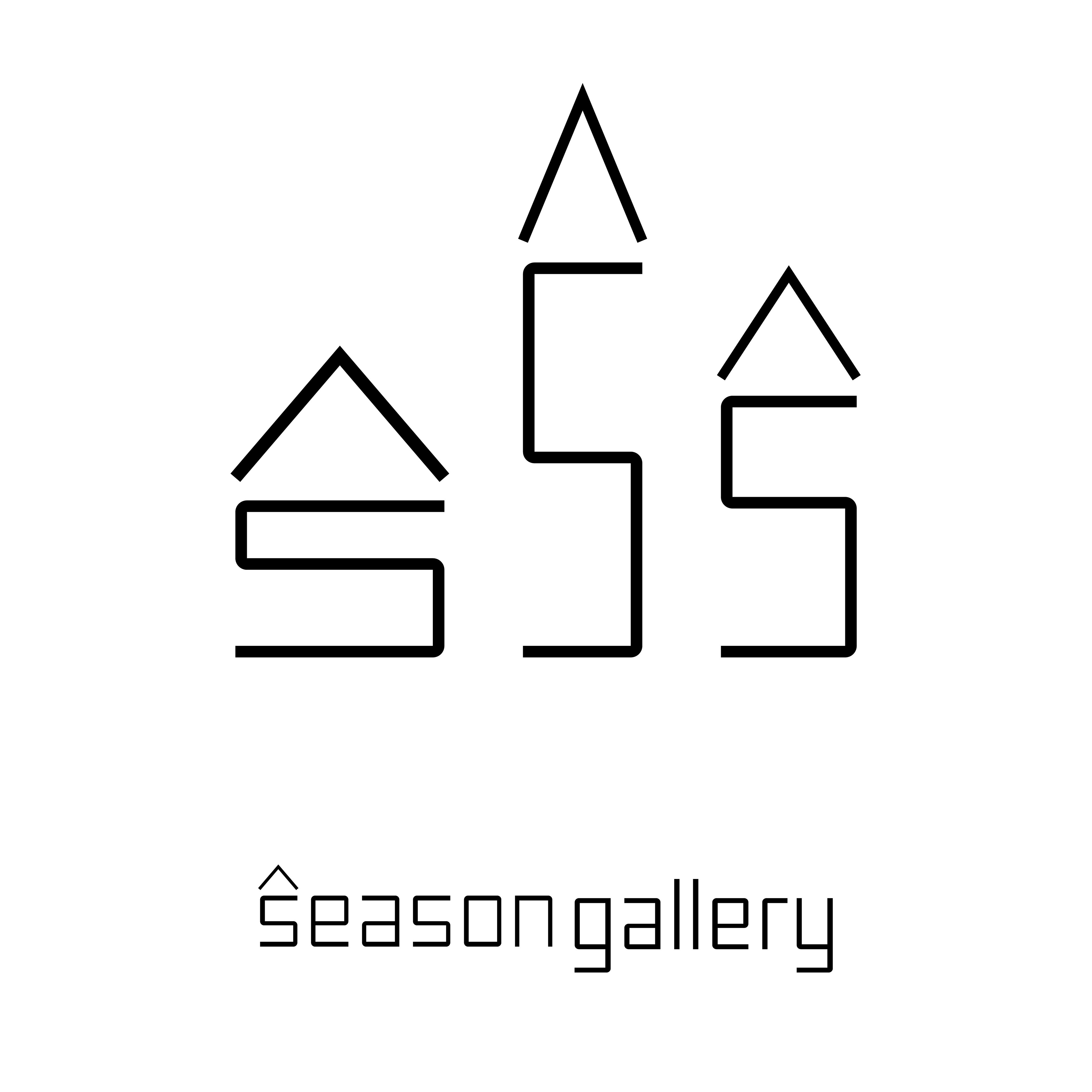
Final Logomark
The Brief
Research a given brand and the market, and create a new visual branding system including logo marks, a typographic system, a brand color palette, and extended identity pieces. Assemble these pieces in a final Visual Identity Manual.
The Client
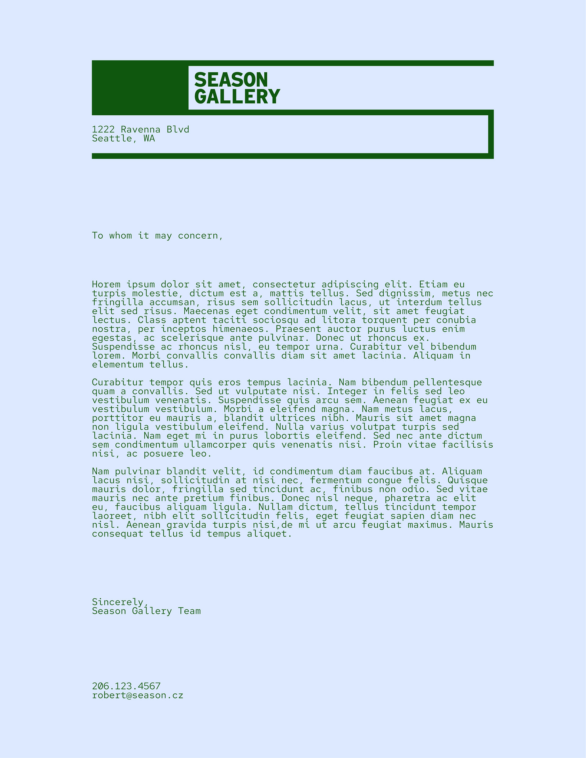
Season Gallery; Student Project
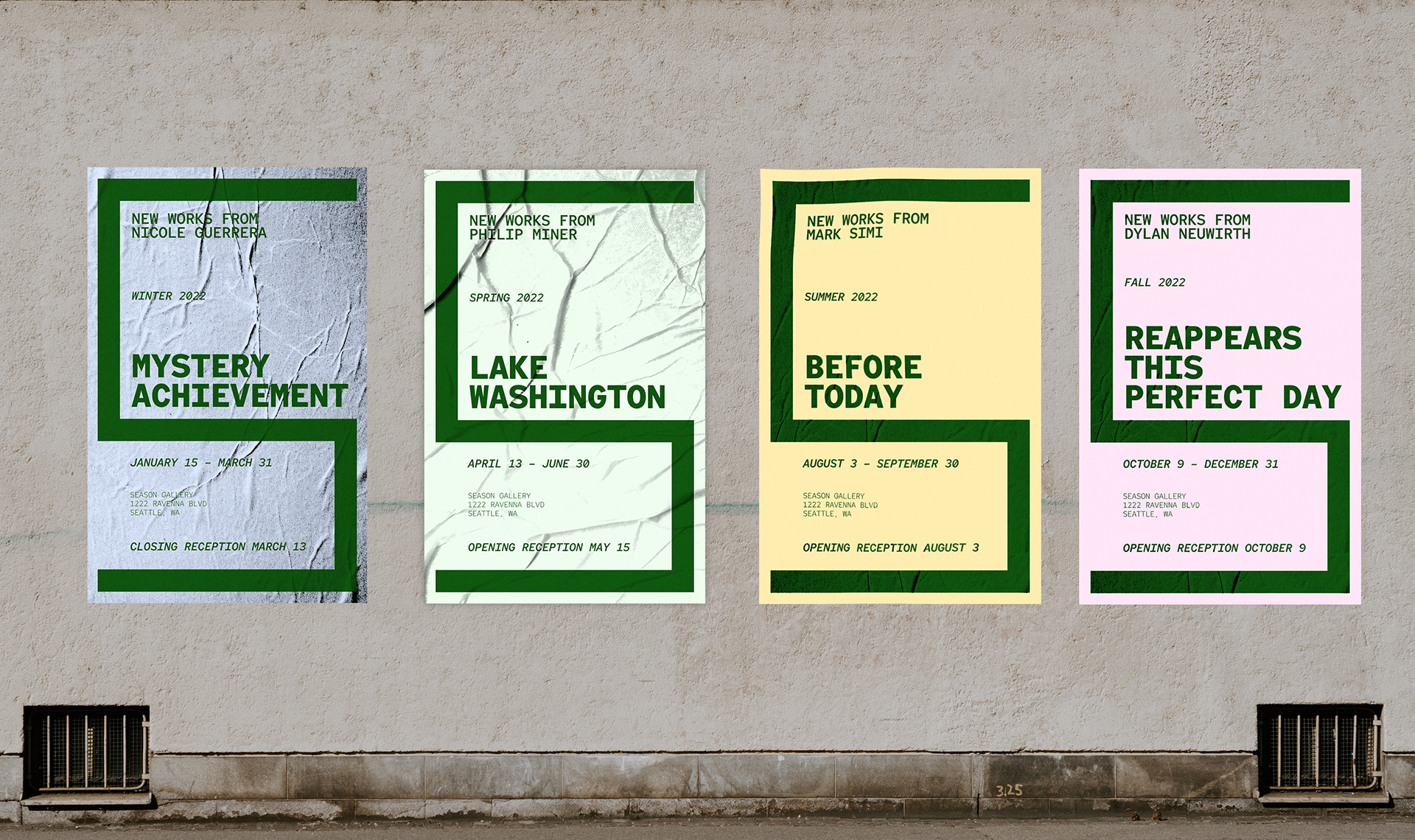
Poster series for a year's worth of shows
The Process
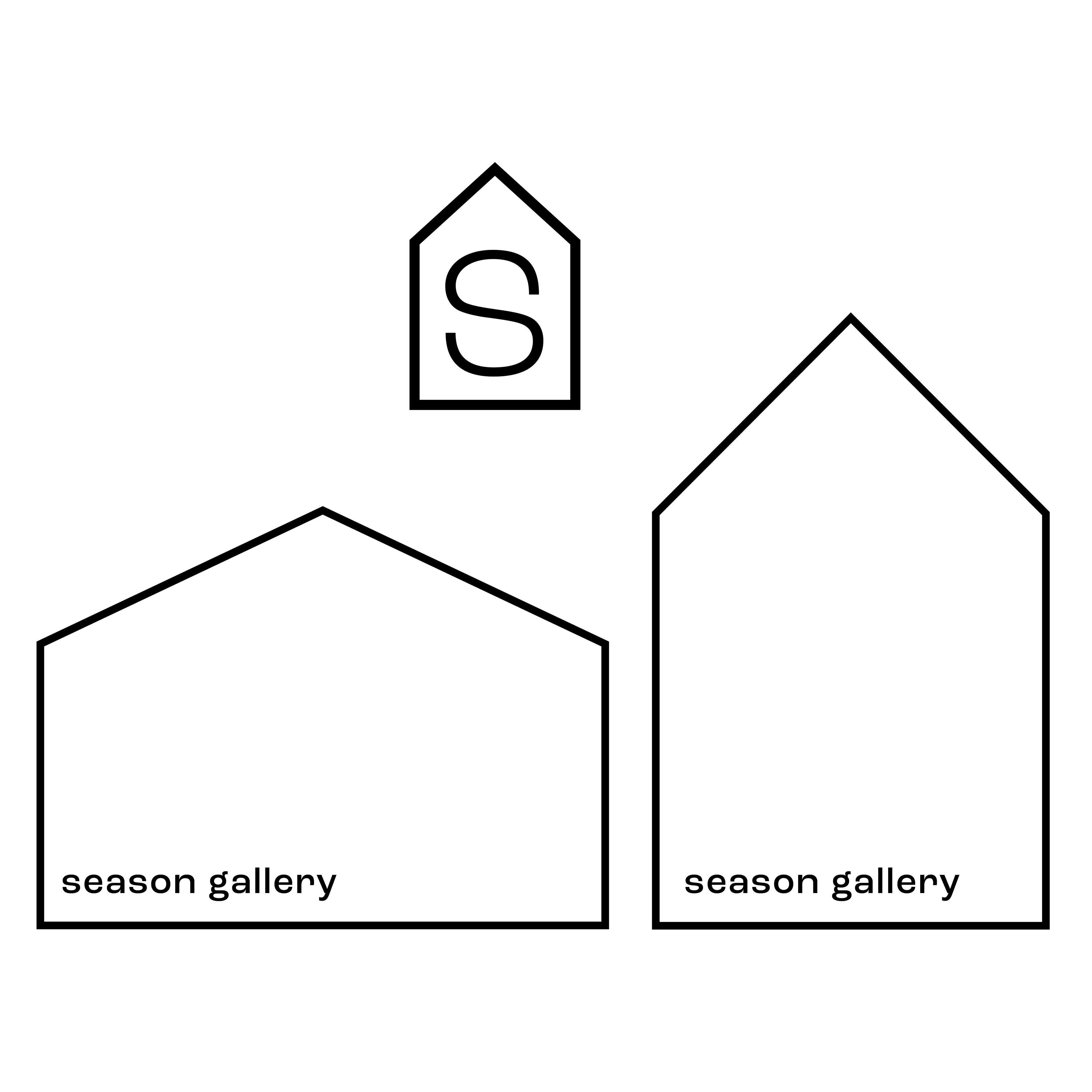
Season Gallery is a local art gallery in the University/Ravenna neighborhood of Seattle. This gallery space exists in the owner’s own house, creating a more inviting, colloquial, and “house-party” atmosphere than normal gallery and museum spaces.
Their Objective: Provide a unique and unorthodox gallery experience contrary to the art gallery status-quo.
The Target Audiences: Art enjoyers and artists looking for an innovative gallery experience
For art enthusiasts looking for a gallery experience that is unorthodox, Season Gallery is the space that turns a gallery opening into a house party, by inviting the audience into their home. taking the art from the white walls of a gallery into their own living room.
Additional Creative Considerations: While breaking free from the norm is true to the values of Season, keeping the brand neutral enough to let the art stand out is key. Also must make sense in the context of the home, and fit on a variety of applications: signage, social media, swag, publications and announcements.
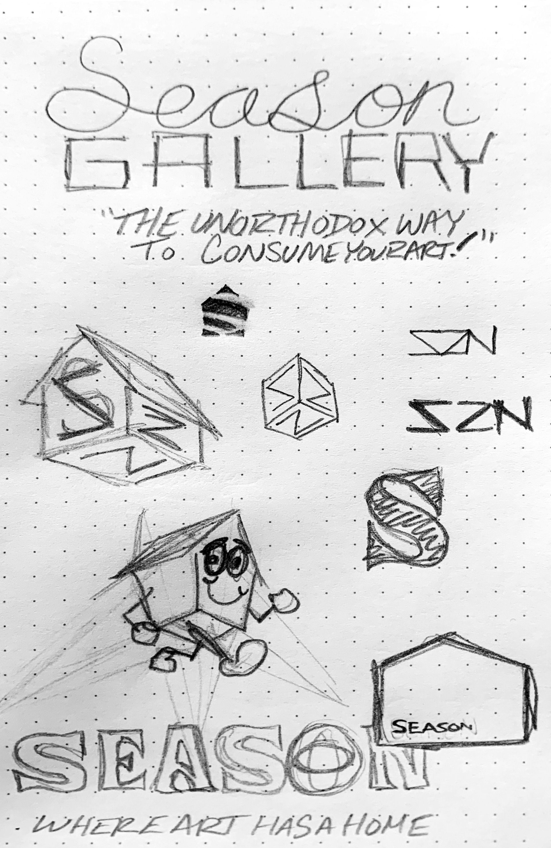
After this research, I began creating mood boards for our rebrand. Some key concepts that came out of this phase of the project were the ideas of variability, scalability, and the beginnings of a visual aesthetic.
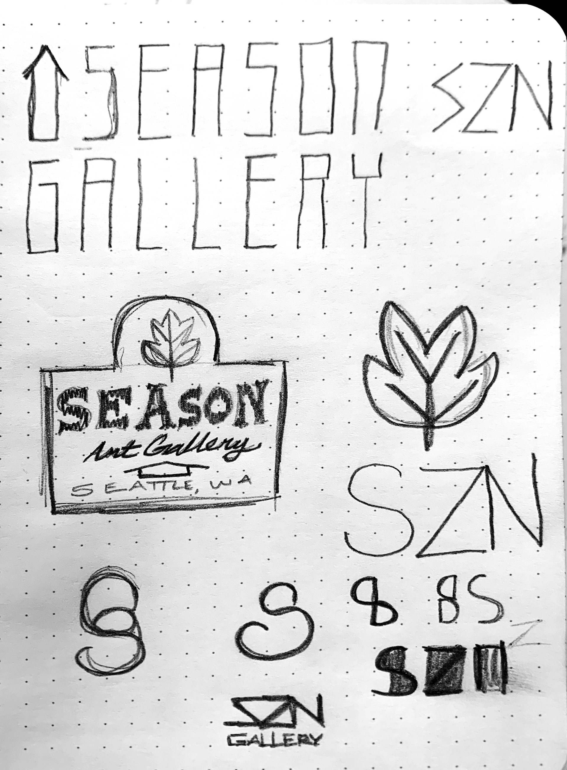
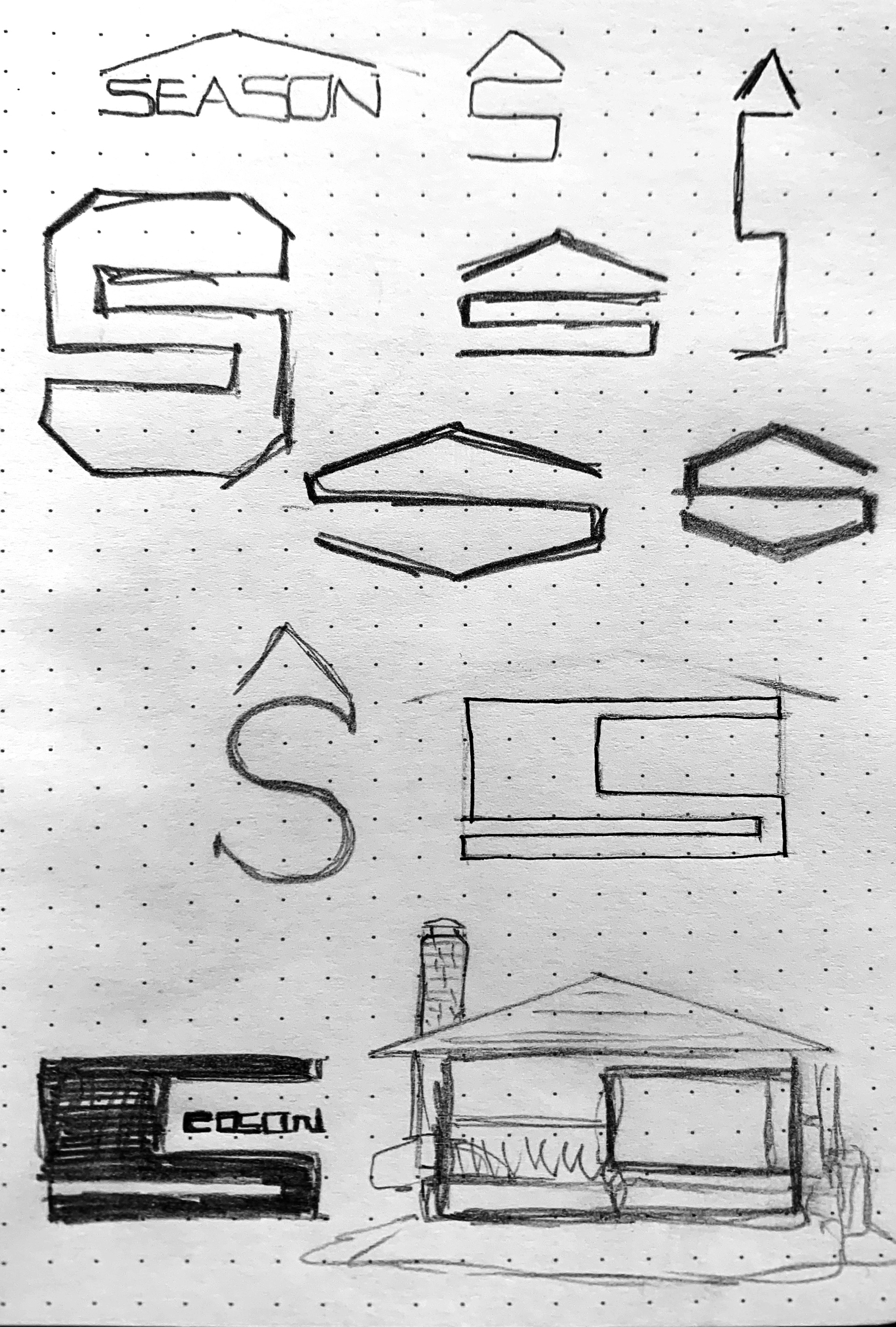
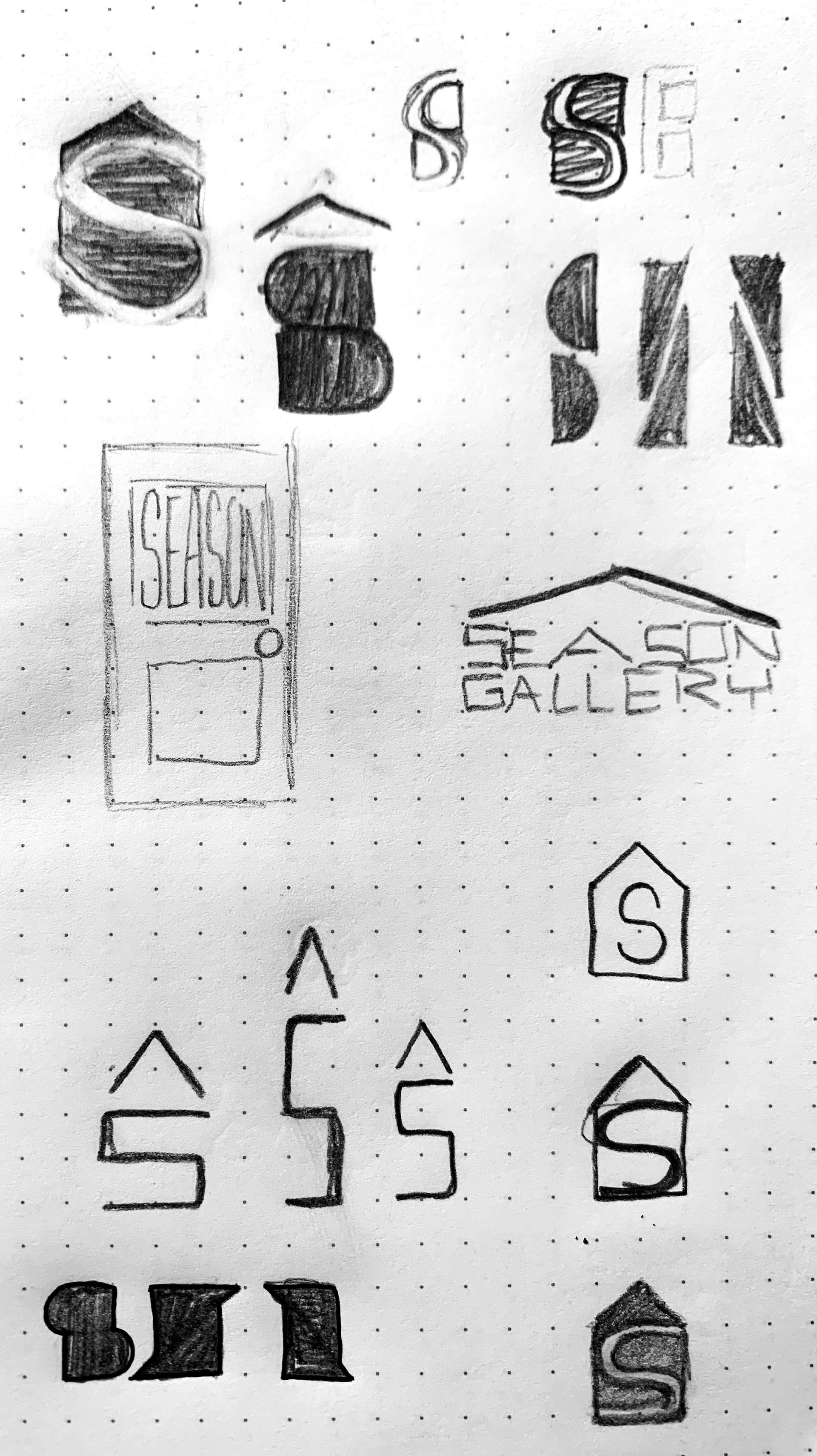
These threads were explored in my initial sketches and vector illustrations. The third of which was the most exciting.
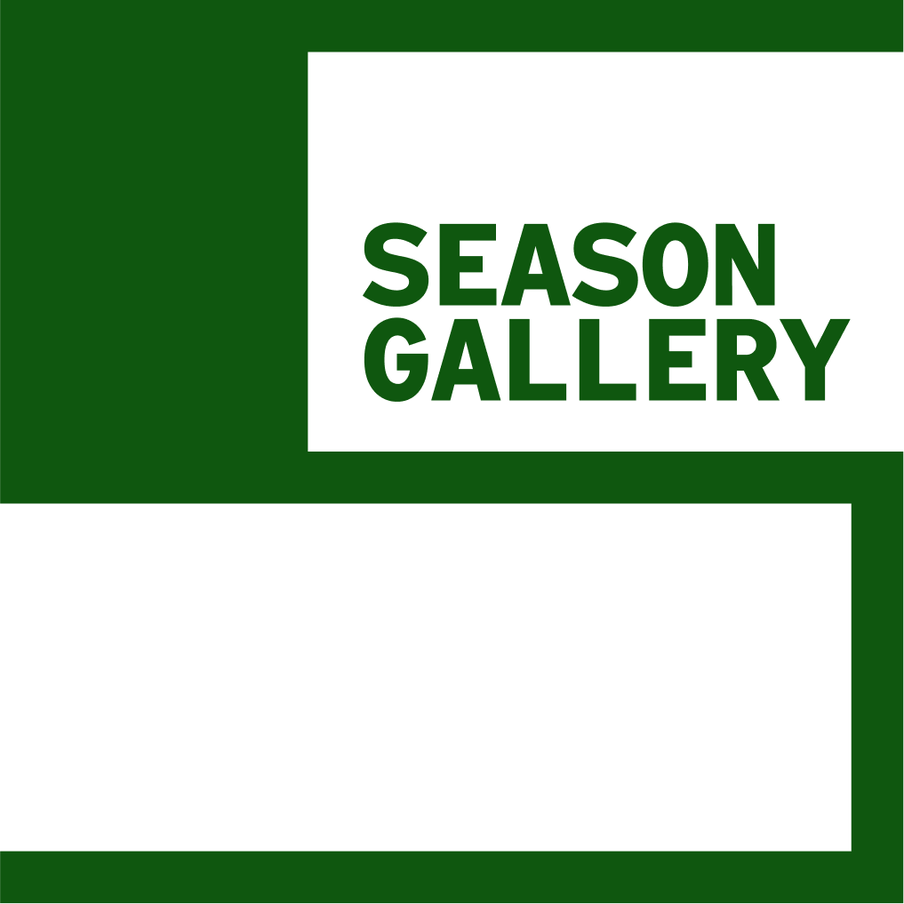
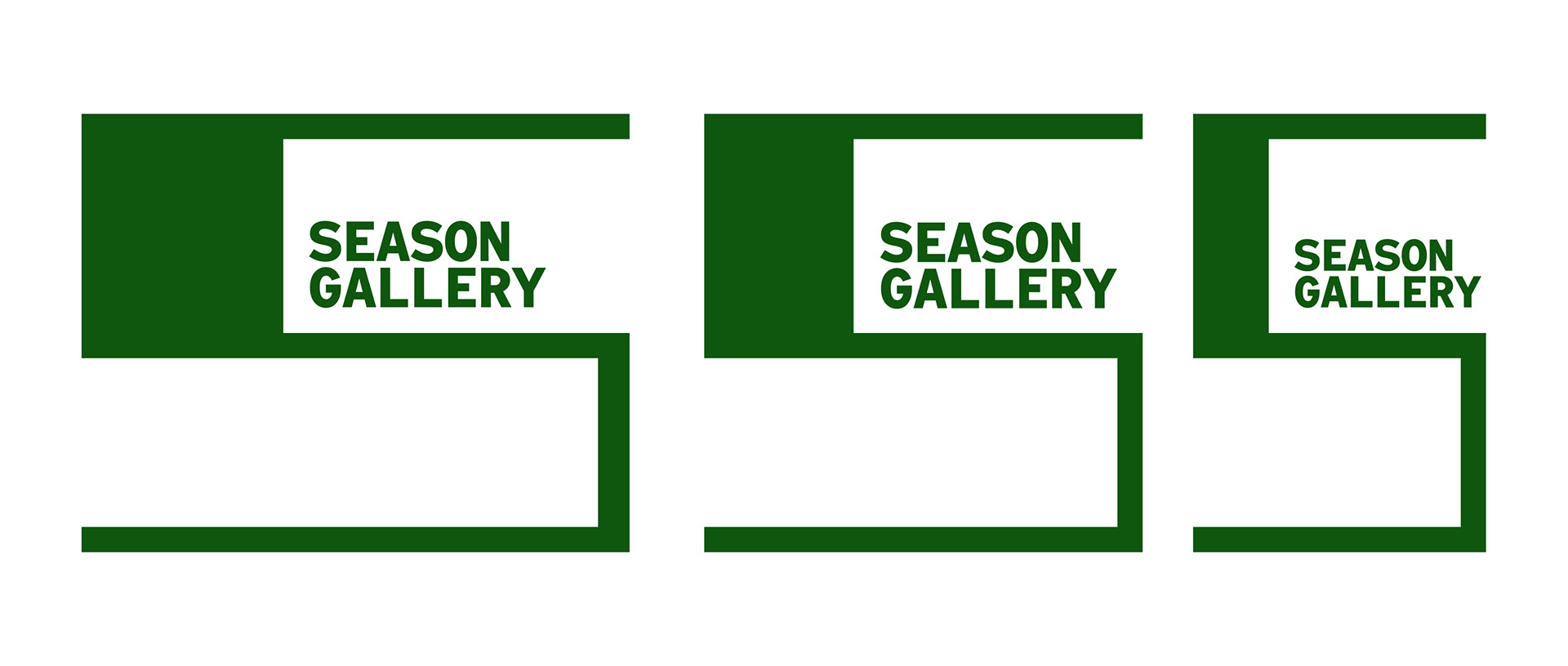
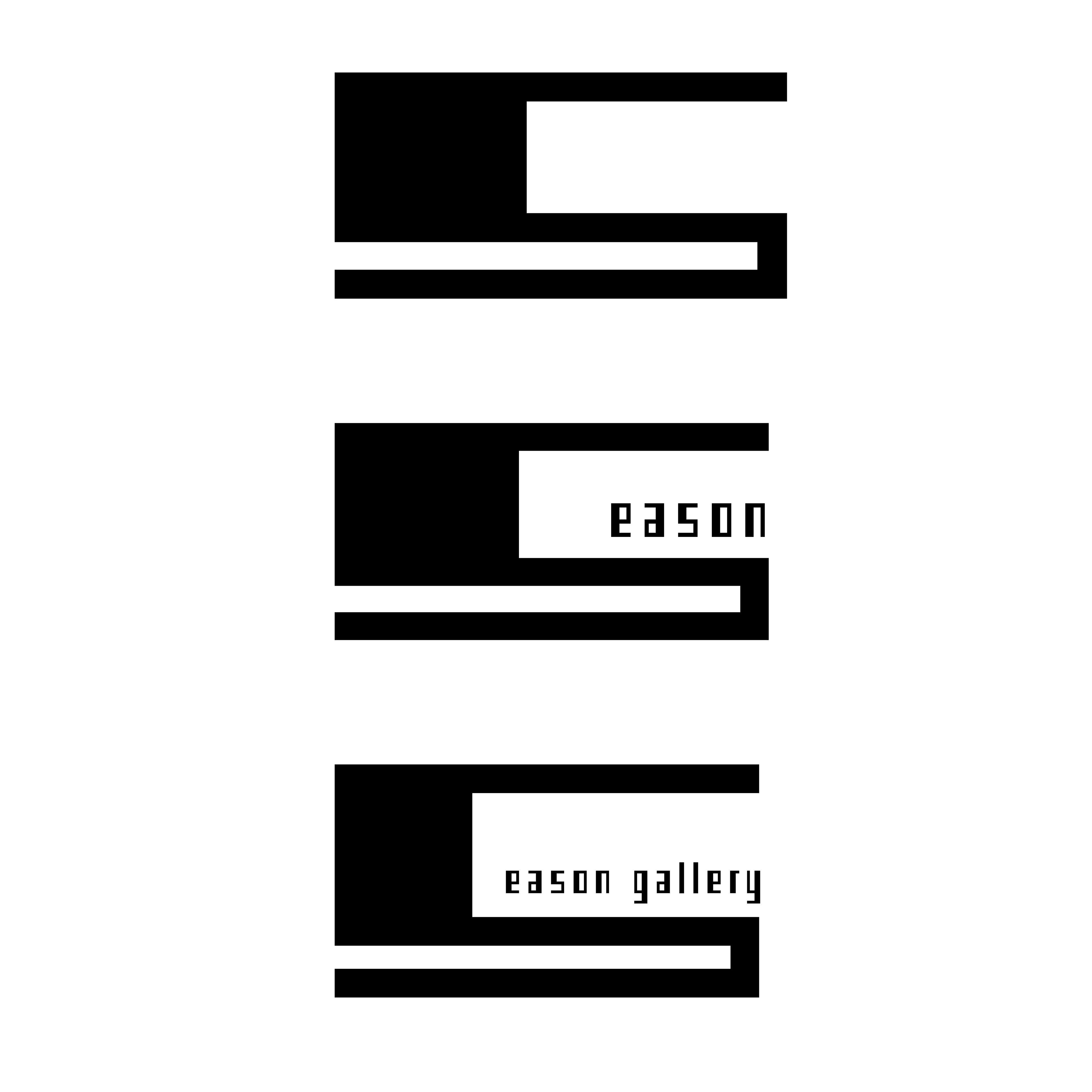
This S mark is based on the house that Season Gallery is in. I also had the idea of the S being able to turn into a responsive frame that can contain text and images, inspired by the Whitney Museum rebrand by Experimental Jetset as well as Yeseul O’s branding for the High Museum in Atlanta, GA.
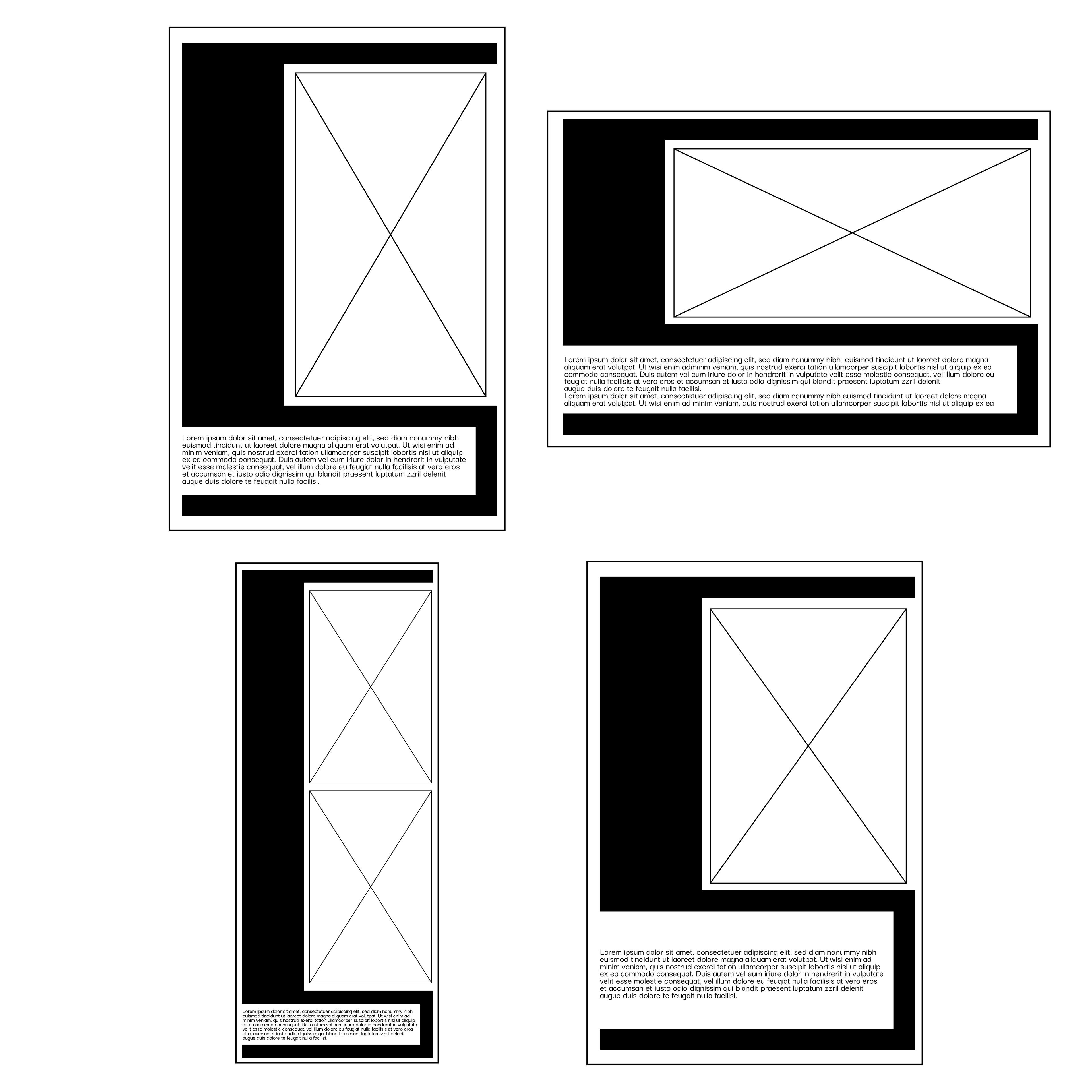
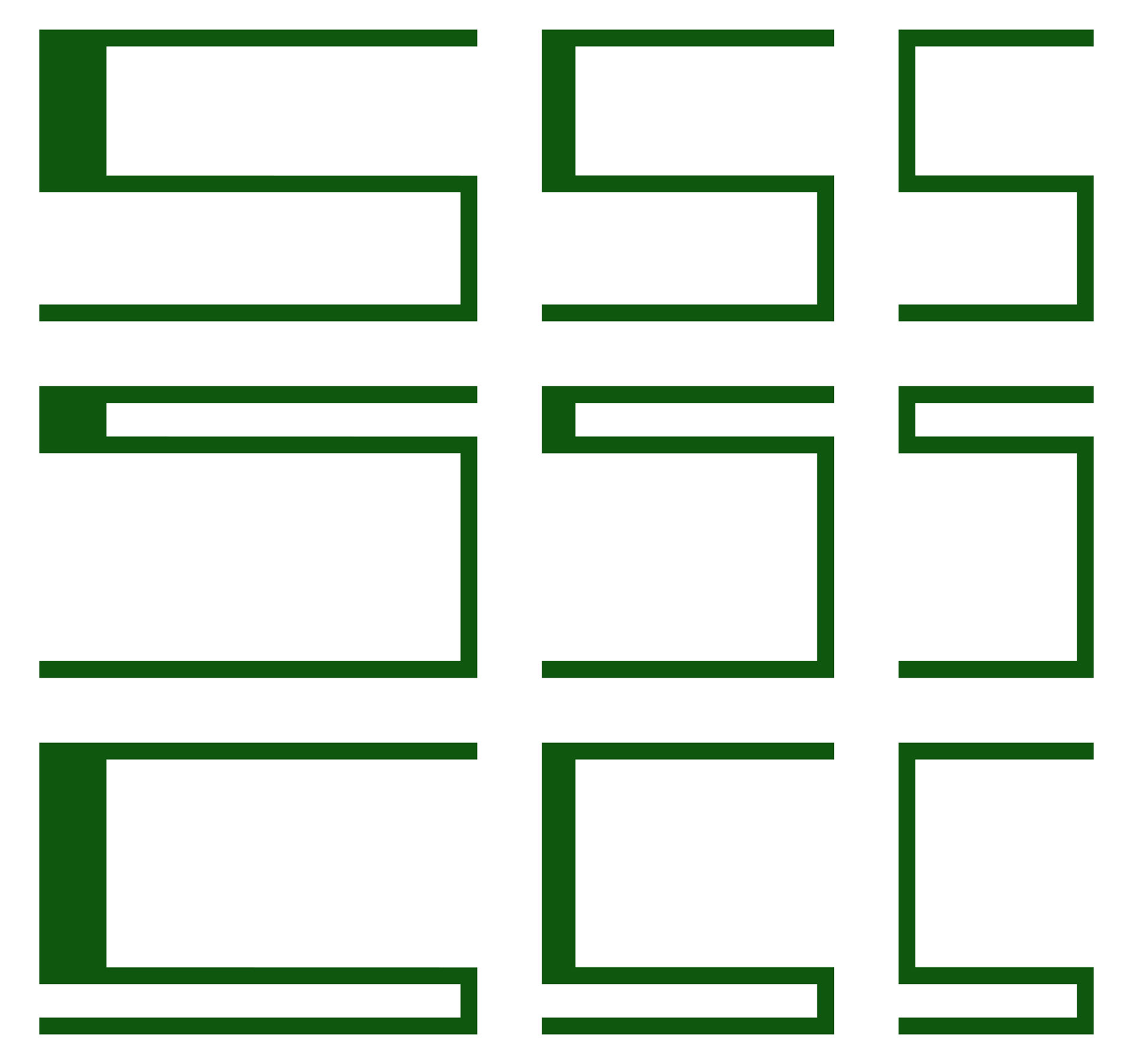
After exploring the responsive mark idea, I finalized on 3 main marks: A square, a horizontal, and a vertical format. These marks also informed the frames, which take 9 basic formats.
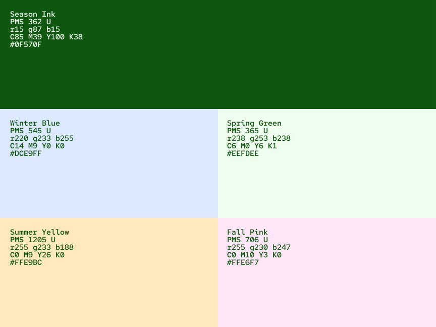
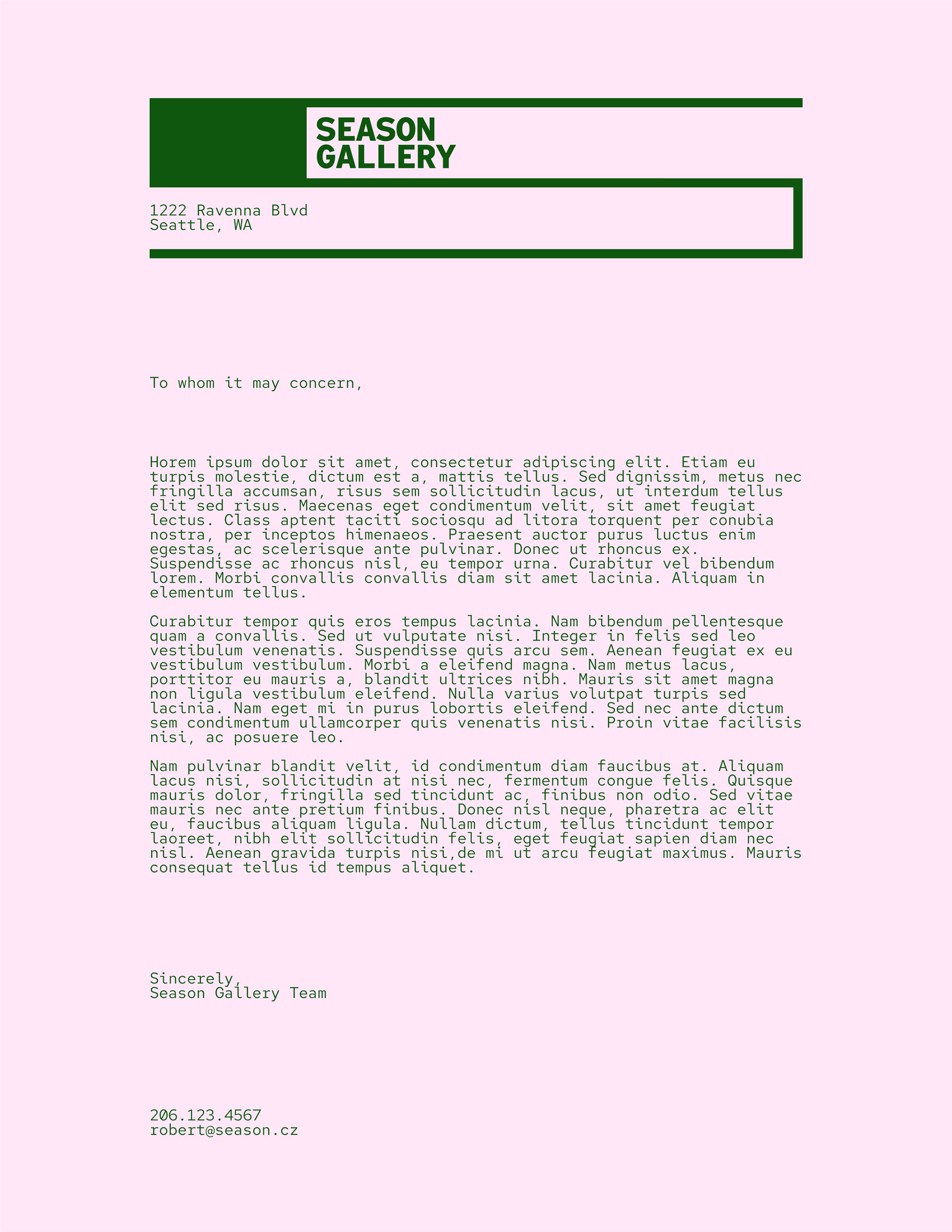
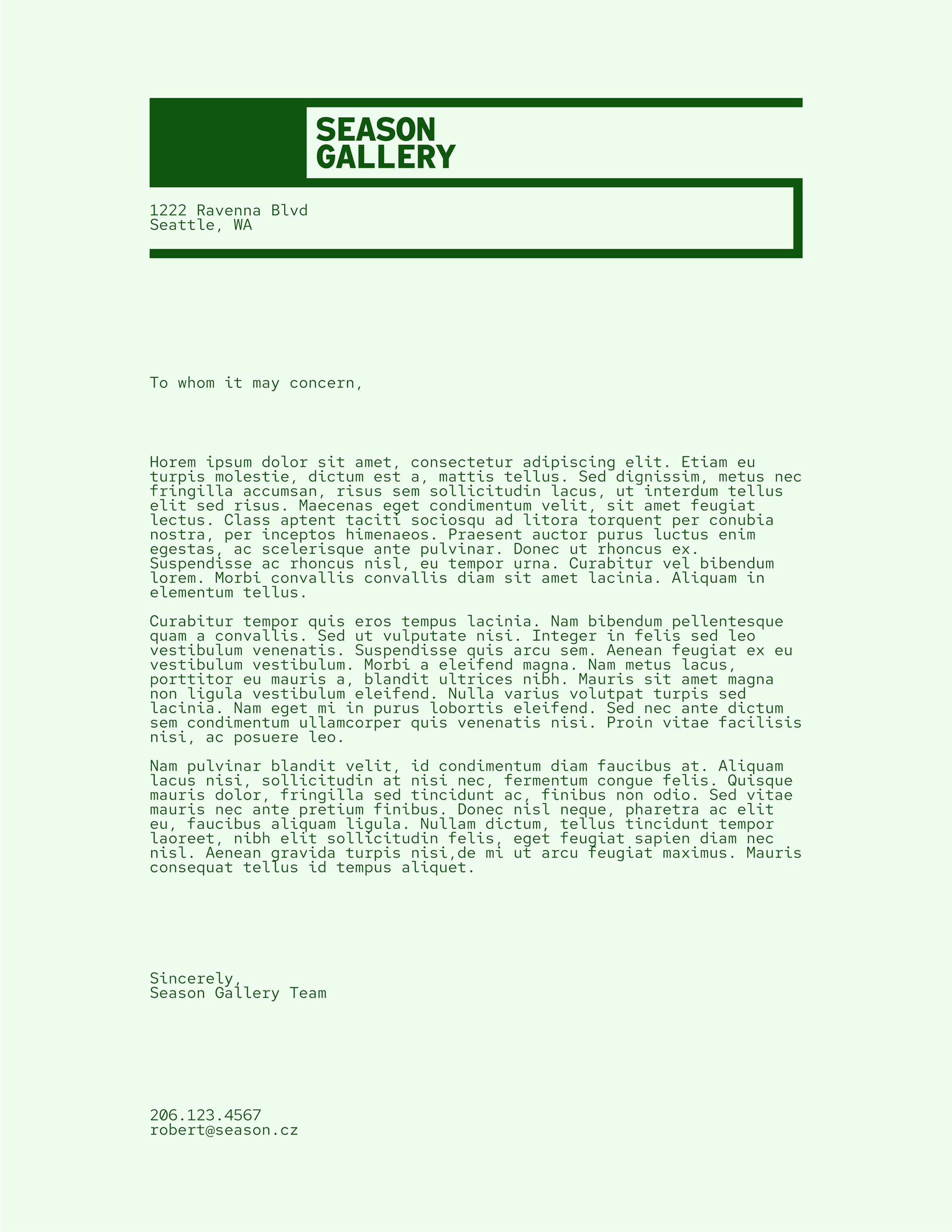
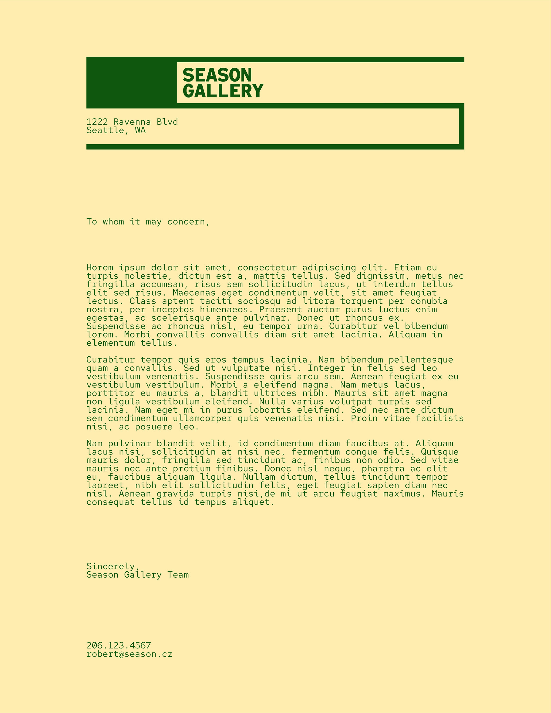
The color palette was created to give each season's show it's own identity. Season Gallery shows four exhibition throughout the year; one each during winter, spring, summer, and fall. Any publication, social media post, or online content relating to the current season's show would be use the respective color as a background (or be printed on paper of that color), using Season Ink as the color for graphics and text.